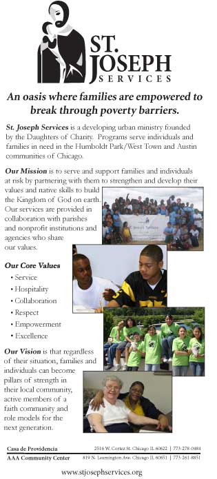
As a collective, our team submitted many versions and mock-ups of the St. Joseph logo based on the client’s wish to “humanize” the look of the logo. Once a collection of logos were reviewed by the group, a select number of logo mock-ups were submitted to the client review. The client indicated a reluctance to overtly change the structure of the logo but chose to reverse the side of the logo in which the person of St. Joseph was placed (from right to left). The client opted to keep the fonts and the sub-line “A Ministry of the Daughters of Charity”. The client also approved the color palette the team chose to submit to them, which was a derivation of the National Daughters of Charity colors.
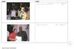
Once the logo was selected, the collateral materials (letterhead, envelope, brochure, business card, newsletter, etc.) were created and collected on Basecamp by the team. Once everyone on the team had a chance to submit their vision of a successful piece(s) of collateral, all pieces were reviewed by the team to determine which single pieces would be included in the Graphic Standards Manual.


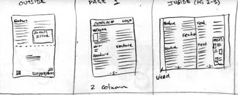
We decided not to stray too far away from the existing newsletter layout because it actually worked pretty well. We cleaned up the columns, established typeface standards, spacing standards, and image standards, and adjusted the header to make it appear cleaner and consistent with the other deliverables. The final newsletter layout is not much different from the sketches because the sketches were used as an aid to help visualize folds and to accommodate double-sided printing.
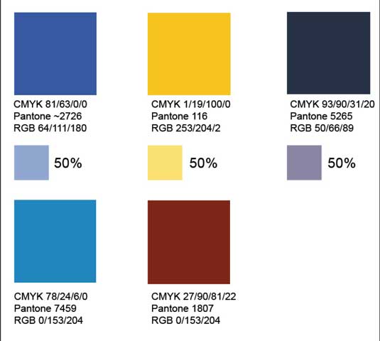
The team met with Lisa Sullivan the Executive Director of St. Joseph's; we agreed that earthy tones would work well for the color palette. Lisa suggested that the Daughters of Charity website would be a place to look for ideas. Two websites were viewed for inspiration - the U.S. chapter site that St. Joseph's site linked to, and international chapter site. A screen capture from the home pages on these sites were placed in Photoshop and color samples were taken while keeping in mind their symbolism in Catholic Church. In the end, the blue was chosen as the primary color since blue represents hope, good health and the state of servitude.
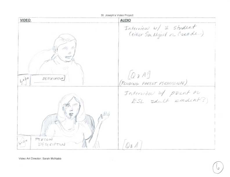
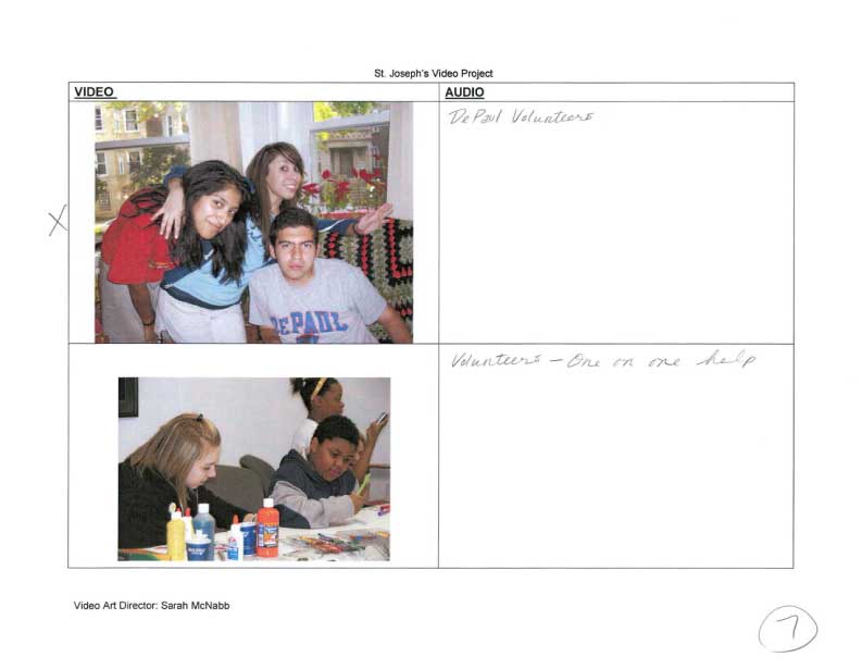
The team made multiple site visits to both the Humboldt Park and Austin location with video equipment from the DePaul CDM Cage (Loop location) to interview the following people (an employee, a volunteer, and a participating child):
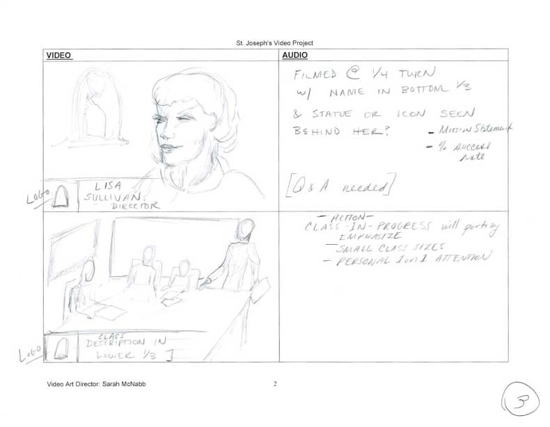
Lisa Sullivan- Executive Director
NiaPearl Miner Clark- 8th Grade student
Rocio Arreola – ESLS and PC Instructor
Denise Smalley – Coordinator of Family Services
Sr. Theresa Sullivan, D.C.- Vocational Director, Daughters of Charity
Bradley Johnson – Site Manager, AAA Community Center
Shirley Harris- Parent, Grandparent
Sr. Patricia Dunn, D.C.- Board of Directors
Sr. Cathrine Marie Lowe, D.C. – Board of Directors
By Sarah McNabb, Video Art Director:
Rough Video Time Goal: between 6 – 8 minutes.
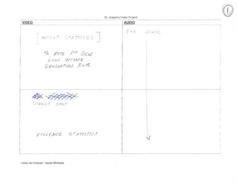
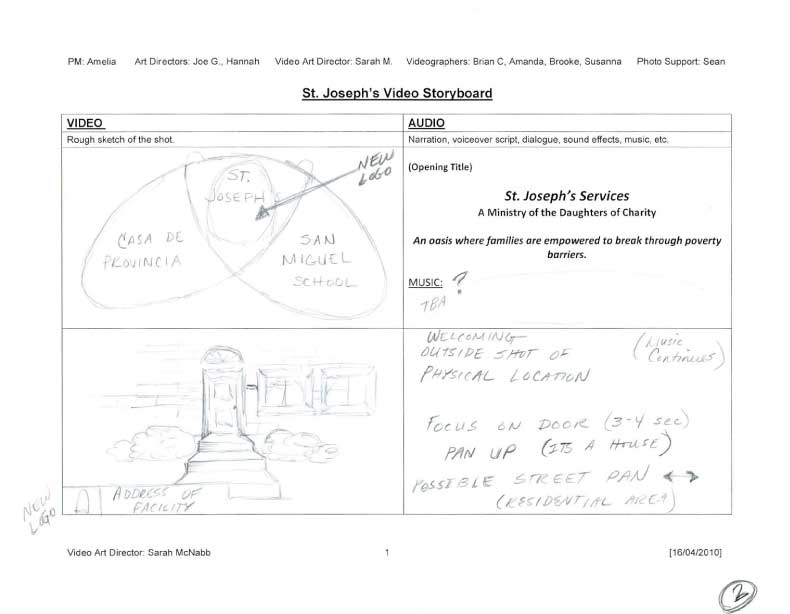
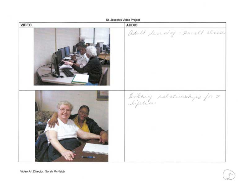
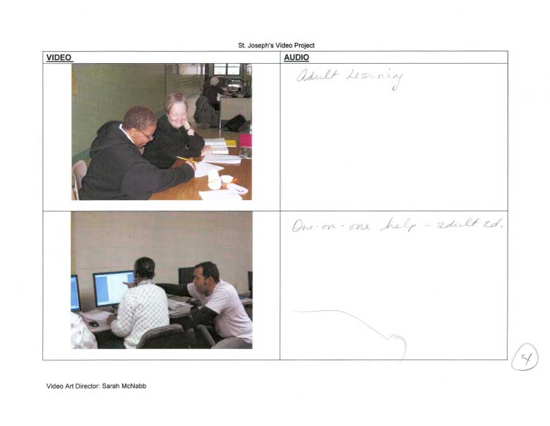
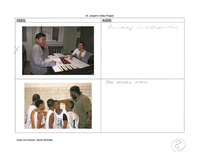
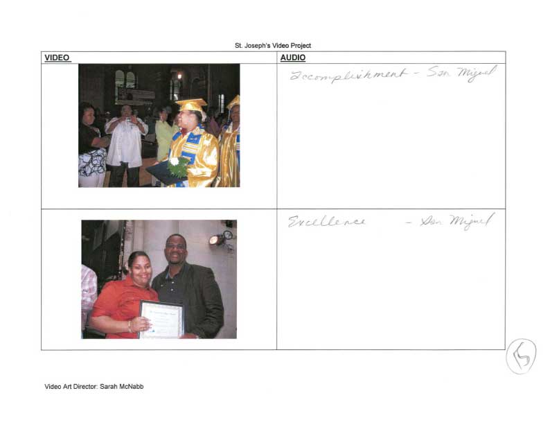
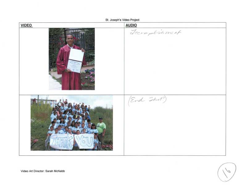
As a collective team, we originally discussed starting out the St. Joseph Services video with some grim statistics of drop-out rates and violence in the first few frames of the storyboard, adding in photos of the at-risk kids' neighborhood and some somber music to grab the viewer. We then thought we could transition into an outside shot of either the Casa de Providencia location or the AAA Community Center location. Next, we envisioned proceeding into the Executive Director (Lisa Sullivan) interview in an effort to have her talk about the organization as an oasis for children and families in need. This, we thought, could lead into the English as second language classes accompanied with photos of actual adult classes taking place. Field trips and group activities of the children who are involved in St. Joseph Services would appear with voiceovers of explanations of the extracurricular and socially beneficial programs that St. Joseph’s offers. To end on a very high note, our team agreed to initially complete the video with uplifting music and photos / film of student accomplishments.
Due to limited availability of the team members to film and because our team had several members interested in learning and participating in cross-over creative portions of the projects, as a team it was decided that each person’s official “title” would be dropped and instead we would proceed as a multi-functional team, which proved to be a successful maneuver as the many needs of the client were met in a timely and diversely creative manner.


By Sarah McNabb, Video Art Director:
Refined Video Time Goal: between 9 – 9.5 minutes
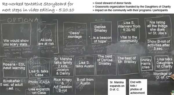
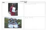
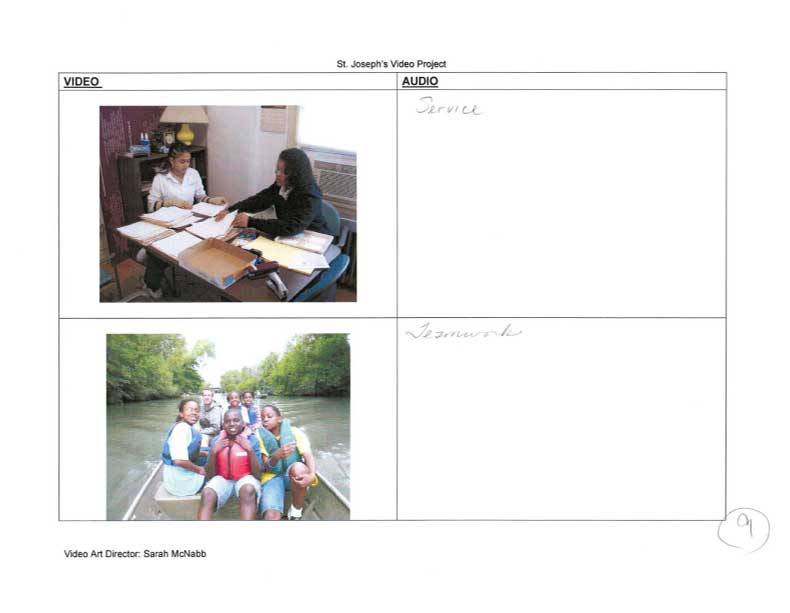
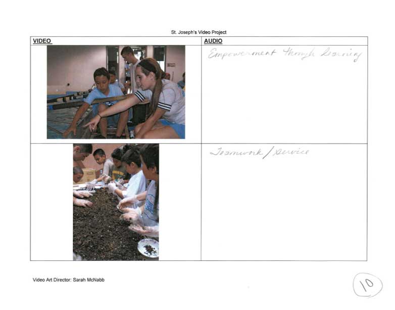
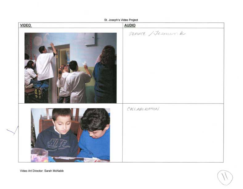
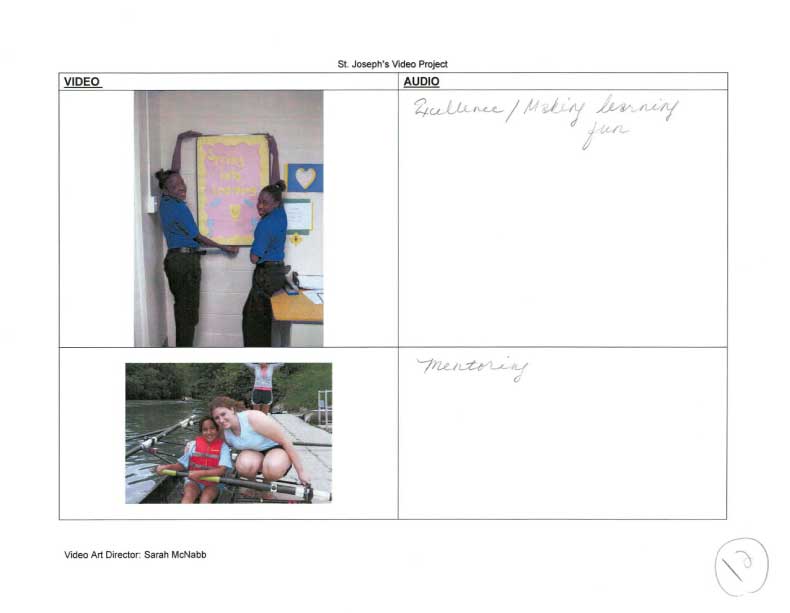
Following the interview conducted at the Austin location and hearing the candid views of AAA Community Center Director Bradley Johnson, the group decided to revise the initial storyboard and remove instances where mood/tone/insinuation of the “at risk” label would appear, this includes the original violence, drop- out statistics, grim music, etc. See revised storyboard (see PDF). Additionally, the multiple interviews conducted all maintained the common term of “oasis” when describing St. Joseph Services. It was this common “descriptive link” which brought our team into agreement in focusing on the positive aspect of the organization while maintaining a positive message geared toward the general biodiversity of both communities in which St. Joseph Services operate.