
|
|
|
|
TUTORIAL: SCATTER PLOTS IN R.- The following is a tutorial for creating scatter plots in R for my students and others that might find it useful. Scatter plots are a popular type of graph for plotting the relationship between two continuous variables like size vs. weight. They are very commonly used in studies of morphological variation. Before beginning, you should have R, RStudio, and ggplot2, downloaded and ready for use. See my Beginning Work in R Tutorial. Note that the code is included in the gray boxes below to make it easy to cut and paste. The explanations are interspersed in regular html. To begin, you will need to set the working directory, open the file, and attach the variables. To set the working directory, use the setwd function. Select the location on your computer where you created a folder for the data and output files. R will look for your data file and save output files in this folder. I created a folder specifically for this scatter plot tutorial in my R_work folder.
|
|
setwd("C:/1awinz/R_work/scatter_plot_tutorial") |
You can check that the working directory was set correctly by using the "getwd()" command.
|
|
getwd() |
R should list the correct working directory as output once you hit enter. Then we will open our data file. Data files can be generated in Excel by saving spread sheets as tab delimited text files. My example data file is called "data_RS_SL_HL.txt". It includes standard length (SL) and head length (HL) data for 50 male and 50 female anadromous (sea-run) threespine sticleback collected in Rabbit Slough, Alaska. The data are from a study published by Aguirre and Akinpelu (2010) on sexual dimorphism of head length in threespine stickleback that includes many Alaskan stickleback populations (click here for the pdf). We will use data from just one anadromous population in this tutorial for simplicity. The data file is located on Github if you want to download it and use it in this tutorial (click here to download the data file). This data file has headers (variable names). If you are using your own data file, make sure to indicate whether it has headers and attach the variable names to the data file and list the data. Use the following commands substituting the name of your data file if necessary:
|
|
read.table("data_RS_SL_HL.txt", header=T) data=read.table("data_RS_SL_HL.txt", header=T) attach(data) names(data) |
The first command "read.table("data_RS_SL_HL.txt", header=T)", should result in a listing of your data. The second command, "data=read.table("data_RS_SL_HL.txt", header=T)", assigns the name "data" to the data table and indicates that it has a header (T is for true indicating that the first row lists the variable names). The third command "attach(data)" attaches the variable names to the data file, and the final command "names(data)" lists the variable names. You should see "Sex" "Spec" "SL" "HL" as output for the variable names if you are using my example data file. Now that the data file is open, we will first make a simple scatter plot using the following command (remember to make sure that you have the ggplot2 package open):
|
|
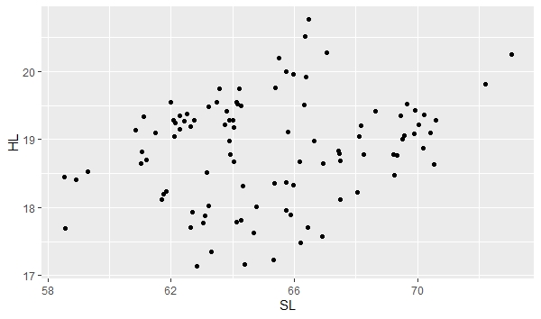
ggplot(data, aes(x=SL, y=HL)) + geom_point() |
"ggplot" is telling the program to create a plot using your "data" file. "aes" is short for aesthetic and is defining your x and y variables in this case. The "aes" function has other uses too. "geom_point()" is specifying the plot type as a scatter plot. The plot will appear in the bottom right window of RStudio under the Plot tab. You can easily save this plot as an image or pdf and indicate the image size using the export function in RStudio.
|
 |
|
ggplot allows you to save the base plot and easily modify it by adding layers. We can save the scatter plot as a variable named "a" (you can name it anything you want, just substitute in the code below) using the following command. Note that this is just defining your base plot under the name "a", so no new plot should appear.
|
|
a <- ggplot(data, aes(x=SL, y=HL)) + geom_point() |
To add colors to the scatter plot, you can use the color function. Note that the base scatter plot is now called "a" and you simply add colors to it using the following command. Also note that we are telling gglot to assign colors using the variable "Sex", which is part of the data file.
|
|
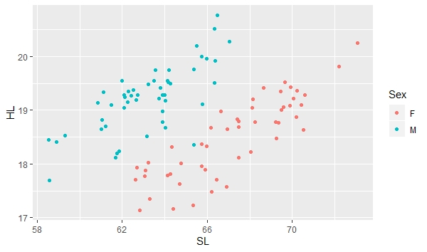
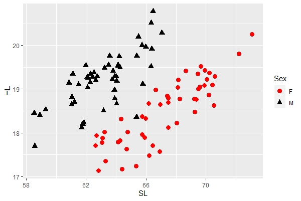
a + geom_point(aes(color=Sex)) |
 |
|
Note that what appeared previously to be a pretty broad scatter of points with a relatively poor correlation between standard length (SL) and head length (HL) now clearly shows two groups of points, each showing a relatively tight fit between SL and HL. This is because there is relatively strong sexual dimorphism in head length in the threespine stickleback, with males having longer heads relative to females in individuals of the same size. To add color and shape automatically, combine the color and shape functions designating levels by the variable "Sex". You can also specify the size using the following command:
|
|
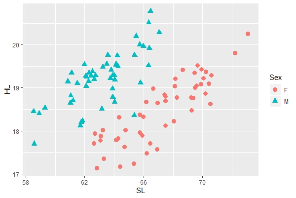
a + geom_point(aes(color=Sex, shape=Sex), size=3) |
 |
|
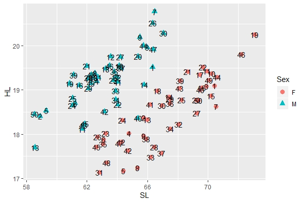
To add labels to the points, you can use the following command. In this case, the labels are the specimen numbers, which are included as a variable (Spec) in the data file. You'll again notice that you can add new features to the image by using the "+" sign after our "a" base plot.
|
|
a + geom_point(aes(color=Sex, shape=Sex), size=3) + geom_text(label=Spec) |
 |
|
You can change the color, shape, and size of the points manually using the "scale_shape_manual" and related functions. This let's you choose the colors and shapes that you want vs. those automatically designated by the program. Note that there are two sex (levels), so you manually designate these two levels as follows:
|
|
a + geom_point(aes(color=Sex, shape=Sex, size=Sex)) + scale_shape_manual(values=c("circle", "triangle")) + scale_color_manual(values=c("red", "black")) + scale_size_manual(values=c(3, 3)) |
 |
|
Let's save the new image as a variable to simplify adding more features. We will save it as "anew":
|
|
anew <- a + geom_point(aes(color=Sex, shape=Sex, size=Sex)) + scale_shape_manual(values=c("circle", "triangle")) + scale_color_manual(values=c("red", "black")) + scale_size_manual(values=c(3, 3)) |
|
|
|
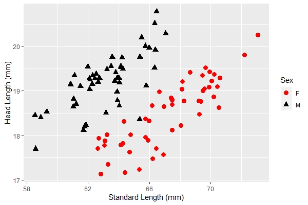
anew + xlab("Standard Length (mm)") + ylab("Head Length (mm)") |
 |
|
|
|
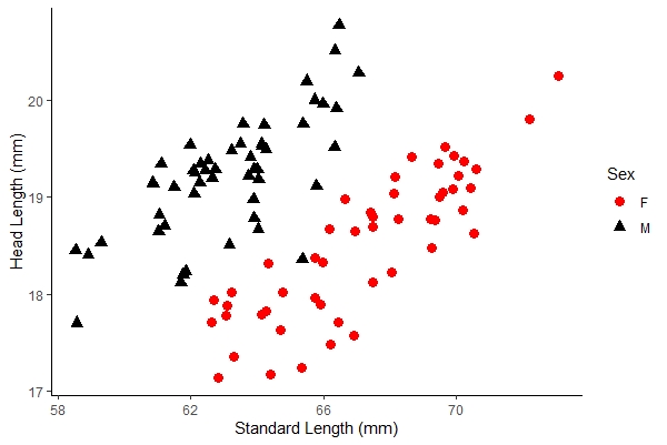
anew + xlab("Standard Length (mm)") + ylab("Head Length (mm)") + theme_classic() |
 |
|
|
Date last modified: Feb/28/20
Date created: Dec/27/18 (by: Windsor Aguirre)