
|
|
|
|
TUTORIAL: SCATTER PLOTS WITH REGRESSION LINES AND CONFIDENCE INTERVALS IN R.- The following is a tutorial for creating scatter plots with regression lines and confidence intervals in R. As seen in the Scatter Plot tutorial, scatter plots are a popular type of graph for plotting the relationship between two continuous variables like size vs. weight. They are very commonly used in studies of morphological variation. Before beginning, you should have R, RStudio, and ggplot2, downloaded and ready for use. See my Beginning Work in R Tutorial. Note that the code is included in the gray boxes below to make it easy to cut and paste. The explanations are interspersed in regular html. To begin, you will need to set the working directory, open the file, and attach the variables. To set the working directory, use the setwd function. Select the location on your computer where you created a folder for the data and output files. R will look for your data file and save output files in this folder. I created a folder specifically for this scatter plot tutorial in my R_work folder.
|
|
setwd("C:/1awinz/R_work/scatter_line_ci") |
You can check that the working directory was set correctly by using the "getwd()" command.
|
|
getwd() |
R should list the correct working directory as output once you hit enter. Then we will open our data file. Data files can be generated in Excel by saving spread sheets as tab delimited text files. My example data file is called "data_RS_SL_HL.txt". It includes standard length (SL) and head length (HL) data for 50 male and 50 female anadromous (sea-run) threespine sticleback collected in Rabbit Slough, Alaska. The data are from a study published by Aguirre and Akinpelu (2010) on sexual dimorphism of head length in threespine stickleback that includes many Alaskan stickleback populations (click here for the pdf). We will use data from just one anadromous population in this tutorial for simplicity. The data file is located on Github if you want to download it and use it in this tutorial (click here to download the data file). This data file has headers (variable names). If you are using your own data file, make sure to indicate whether it has headers and attach the variable names to the data file and list the data. Use the following commands substituting the name of your data file if necessary:
|
|
read.table("data_RS_SL_HL.txt", header=T) data=read.table("data_RS_SL_HL.txt", header=T) attach(data) names(data) |
The first command "read.table("data_RS_SL_HL.txt", header=T)", should result in a listing of your data. The second command, "data=read.table("data_RS_SL_HL.txt", header=T)", assigns the name "data" to the data table and indicates that it has a header (T is for true indicating that the first row lists the variable names). The third command "attach(data)" attaches the variable names to the data file, and the final command "names(data)" lists the variable names. You should see "Sex" "Spec" "SL" "HL" as output for the variable names if you are using my example data file. Now that the data file is open, we will first make a simple scatter plot using the following command (remember to make sure that you have the ggplot2 package open):
|
|
ggplot(data, aes(x=SL, y=HL)) + geom_point() |
"ggplot" is telling the program to create a plot using your "data" file. "aes" is short for aesthetic and is defining your x and y variables in this case. The "aes" function has other uses too. "geom_point()" is specifying the plot type as a scatter plot. The plot will appear in the bottom right window of RStudio under the Plot tab. You can easily save this plot as an image or pdf and indicate the image size using the export function in RStudio.
|
 |
|
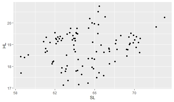
Note the broad scatter in the plot. The plot is showing the relationship between head length (HL) and standard length (SL) for both male and female stickleback. If you look carefully, you can probably tell that it looks like there are two groups. We can separate out males and females by giving them different colors and create seperate lines of best fit and confidence intervals about the lines using the following command:
|
|
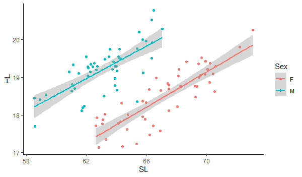
ggplot(data, aes(x=SL, y=HL)) + geom_point(aes(color=Sex))+ geom_smooth(method=lm, aes(color=Sex))+theme_classic() |
 |
|
Notice how we added the "(aes(color=Sex))" to the geom_point to tell ggplot to separate points by sex using color. The "geom_smooth" function is creating the line of best fit and the confidence interval about the line. We also use the "aes(color=Sex)" to tell it to create separate lines for males and females and we use the "method=lm" to specify that we want to fit a straight line. Otherwise, it will fit more complex lines to the relationship. The default of the geom_smooth function is to plot the line with a confidence interval about it. You can turn off the confidence interval by including the command "se=FALSE" for the geom_smooth command. Finally, the "theme_classic()" gives us a white background. Now you know how to create scatter plots with lines of best fit and confidence intervals separated by group. |
Date last modified: Feb/28/20
Date created: Feb/28/20 (by: Windsor Aguirre)