ISP 120 - Quantitative Reasoning
Group Activity 6: Other Charts
Click Here for OpenOffice version
All group activities must include a signed statement from each group member that they participated fully in the assignment.
Please do the following at the beginning of every computer activity.
a. Open a new Word document.
b. Click on the "File" on the top menu bar, then go to "Save As". Give your document a somewhat descriptive name (e.g. "Group Activity 6"). Also save the document to the desktop by setting the "Save in" textbox to "Desktop". (Saving to the desktop makes it easy to retrieve your work when you are finished.)
1. Open the file IL_Pop_By_Race.xls. This file shows the population of Illinois in 2000 classified by race.
a) Add a column which contains the percentage of total population for each racial category. Paste the resulting table into your Word document.
b) Pie charts are used frequently to graphically display the percentages of various
categories that make up a whole. Excel can make them very easily. Let's use Excel to make
a pie chart of the Illinois data. Select the data in columns A and B. (Do not include the
headers.) Click on the Chart Wizard button
![]() in Excel.
You will get a menu like
in Excel.
You will get a menu like
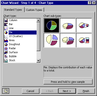
Choose the chart type Pie. Press next and follow the instructions. Try different sub-types; find one your group likes. A good graph always has title telling what it is about. Include your chart in your Word document.
2. Open the file DePaulMajors04.xls. This file shows the number of majors in five subject areas in the years 2000 and 2004.
a) Use the Chart Wizard to create a column chart of this data. (What Excel calls a "column chart" is just a special case of what is usually known as a "bar chart".) Make sure you include all the appropriate labels. Paste your column chart into your word document.
b) Write a brief paragraph describing the largest and smallest enrollments in the two years and the areas in which they occurred.
c) Write another paragraph discussing the change in enrollments over the five-year time period. Form some conclusions about the different areas, citing how you are using the data.
d) Discuss the advantages of using multiple bar graphs to represent data of this type. What limitations might there be to using multiple bar graphs?
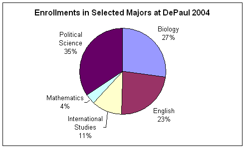
e) Here's a pie chart depicting the enrollments in 2004. What's misleading about this presentation of the data?
3. Consider the following data:
US Population, 2002 |
|
Male |
137,048 |
Female |
143,491 |
White |
212,542 |
African American |
33,768 |
Native American |
1,959 |
Asian Pacific Islander |
11,578 |
Other |
14,187 |
Two or More Races |
6,505 |
Someone made the following pie chart from this data:
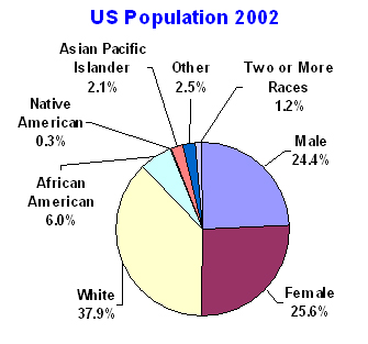
Explain what is wrong with this graph, and make two pie charts from this data that would correctly inform a reader about the composition of United States population in 2002.
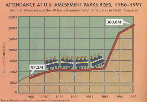
4. Critique the following graph, finding at least one serious misrepresentation. What misleading impression does it give?