-
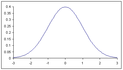
The center is the location of its axis of symmetry.
The spread is the distance between the center and one of its inflection points.
Example: If the data is
Example:
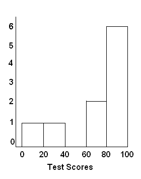
| Bin | Frequency |
|---|---|
| [0,20) | 1 |
| [20,40) | 1 |
| [40,60) | 0 |
| [60,80) | 2 |
| [80,100) | 5 |
Example: Here is the histogram drawn from the table in Step 3.
The spread is the distance between the center and one of its inflection points.