Website Special Effects
Mouse Rollovers
In the most common form, a rollover consists of an image serving as a hypertext link. While the mouse pointer is over the image, it changes appearance to attract attention to the link. For example, you could add a glow effect, a drop shadow or simply change the background color. The onMouseOver and onMouseOut events are used for rollovers. Images are preloaded to avoid delays in transmission. Here is an example of the JavaScript function which can be placed in the document head section or saved as a separate .js file:
<script type="text/javascript">
// Preload the images to avoid delays
overImg=[];outImg=[];
outImg[0]=new Image();outImg[0].src="images/beethovenoff.jpg";
overImg[0]=new Image();overImg[0].src="images/beethovenon.jpg";
function chgImg(img,type)
{
switch(type){
case "over":document.images[img].src=overImg[img].src; break;
case "out":document.images[img].src=outImg[img].src; break;
}
}
</script>
And the HTML document code to be used for each rollover area is:
<a onMouseOver='chgImg("0","over");' onMouseOut='chgImg("0","out");' href="#.">
<img src="images/beethovenoff.jpg" border="0" alt="whatever" /></a>
And here is what it looks like ...

NOTE: These images were created using a freeware painting tool by adding a drop shadow to the text. You can find advice and royalty free clip art on the Web by using a search engine.
The script is completely reusable. Use it for any number of images simply by adding more images to the overImg[] and outImg[] arrays. Every rollover on your site can be pointed to the same external .js file if you wish.
Pull Quotes
Magazine style pullquote...this will look like some of the pullquotes or subtitles you see in magazine layouts...This is the left side plain text. You can type as much as you want here. This would usually contain the quote you want to pull. Do you think this will look like some of the pullquotes or subtitles you see in magazine layouts. It might. It depends on what you type in here.
Inline Pull Quote: You don't have to define the pullquotes in the style sheet. The code is short and doesn't take that many keystrokes. It's just another paragraph in CSS.
Pullquotes or sidebar style text blocks are easy to render with CSS Inline Style. You don't have to define the pull quotes in the style sheet. The code is short and doesn't take that many keystrokes. It's just another paragraph in CSS.
However, if you plan to use pullquotes repeatedly throughout your writings then defining your style of pullquotes in an External Style Sheet or at least at the document level in the HEAD section of your page may make sense. We don't mind typing the few extra keystrokes to get the pull-quote effect in CSS.
...it depends on what we are highlighting or lowlighting...
Font-size:1.5em; will always make our pullquote text size proportionately larger than our default text size. And that might be what we want. Really big text. Again, it depends on what we are highlighting or lowlighting. Do you think lowlighting is a word? It makes sense. If it isn't a word then it should be a word. Actually, I'm just killing time cuz I can and besides I need to fill up space here. Oh, and what about cuz, is that a word - I don't think so, do you?
And what about all those shortened forms for texting, like LOL, KWL, LMAO, OMG, PLZ, and THX. Combining methods is an important part of writing text messages. You must not just use one method, you must use them all when appropriate. An example of combining methods is the word 'ANYONE'. By using the method of sounds and the method of replacing words with symbols and numbers, you would replace the word 'ANYONE' with 'NE1'. This communicates the desired message and halves the number of characters used by the word, giving you more characters to write a longer message.
Next I give the CSS for the above three pullquotes. Just copy and paste the code into your web document where ever you want the pullquote to appear. And, of course, change the text to suit your purpose.
The CSS for the first pullquote
<div style="font-family:monospace;font-size:10pt">
<pre>
<div style="color:#033;width:250px;height:100px;background:white;float:right;
margin: 10px 50px 10px 10px;
font-family:Verdana, Arial; font-size: 18px;line-height:16px;text-align: right;
padding: 10 50 0 0">
...this will look like some of the
<strong>pullquotes or subtitles you see</strong>
in magazine layouts...
</div>
<p style="text-align:justify;font-size:10pt">This is the left side plain text.
You can type as much as you want here.
This would usually contain the quote
you want to pull. Do you think this will
look like some of the pullquotes or subtitles
you see in magazine layouts. It might. It depends
on what you type in here.
</p>
<div style="clear:both;"></div>
</pre>
</div>
The CSS for the second pullquote
<p style="float:right;width:30%;padding:8px;border:1px solid black;
font-size:.8em;margin:20px;background-color:whitesmoke;">
<u>Inline Pull Quote:</u>
You don't have to define the pullquotes in the style sheet.
The code is short and doesn't take that many keystrokes.
It's just another paragraph in CSS.
</p>
<p>
Pullquotes or sidebar style text blocks are easy to render with CSS Inline Style.
You don't have to define the pull quotes in the style sheet. The code is short and
doesn't take that many keystrokes. It's just another paragraph in CSS.</p>
<p>
However, if you plan to use pullquotes repeatedly throughout your writings then
defining your style of pullquotes in an External Style Sheet or at least at the
document level in the HEAD section
of your page may make sense. We don't mind typing the few extra keystrokes to get the
pull-quote effect in CSS.</p>
The CSS for the third pullquote
<p style="float:left;width:30%;padding:8px;border:1px solid black;font-size:1.5em;
line-height:1.2em;margin-top:15px;margin-left;20px;margin-bottom:15px;margin-right:30px;
background-color:whitesmoke;font-weight:bold;">
...it depends on what we are highlighting or lowlighting...
</p>
<p>
Font-size:1.5em; will always make our pullquote text size proportionately larger than
our default text size. And that might be what we want. Really big text. Again, it depends
on what we are highlighting or lowlighting. Do you think lowlighting is a word? It makes sense.
If it isn't a word then it should be a word. Actually, I'm just killing time cuz I can and
besides I need to fill up space here. Oh, and what about cuz, is that a word - I don't think
so, do you?</p>
<p>And what about all those shortened forms for texting, like LOL, KWL, LMAO, OMG, PLZ, and THX.
Combining methods is an important part of writing text messages. You must not just use one method,
you must use them all when appropriate. An example of combining methods is the word 'ANYONE'.
By using the method of sounds and the method of replacing words with symbols and numbers, you
would replace the word 'ANYONE' with 'NE1'. This communicates the desired message and halves
the number of characters used by the word, giving you more characters to write a longer message.
</p>
Magazine Style Drop Caps
Full details for making the first letter big are given in the following Drop Cap CSS inline style. You just need to copy and paste it into any document you'd like it to appear in. For this drop cap we forced the first big letter to span about three lines. The font-size is adjusted to exactly 80 pixels while the line height is 50 pixels. Some padding is added to achieve the desired effect. The entire text is put in a dashed box, so it appears a bit more like it would in a magazine or newpaper article.
The code for the drop cap
<p style="text-align:justify; font-family:times; font-size:12pt;
border: 1px dashed #000;margin-right: 160px; margin-left:117px; line-height: 1.2em;
padding: 9px;">
<span style="float:left;color:darkred;font-size:80px;
line-height:50px;padding-top:1px;padding-right:5px;font-family: times;">F</span>ull
details for making the first letter big are given in the following Drop Cap CSS inline
style. You just need to copy and paste it into any document you'd like it to appear in.
For this drop cap we forced the first big letter to span about four lines.
The font-size is adjusted to exactly 80 pixels while the line height is 50 pixels.
Some padding is added to achieve the desired effect. The entire text is put in a dashed box,
so it appears a bit more like it would in a magazine or newpaper article.</p>
Text Over Image
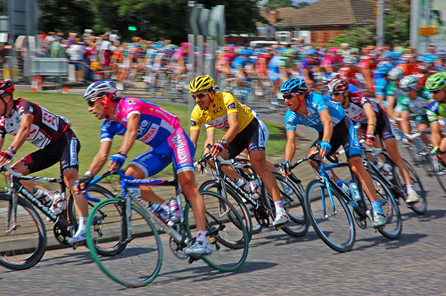
The key when overlaying is the use the position:relative with top and margin-left. I had to tweak the relative positioning a bit to get the text to appear exactly where I wanted it on top of the image. I used the div tag and decided to start the text -330 pixels from the top (the image height is 332). I used a left margin of 165 pixels.
Copy and paste this in your webpage (with appropriate changes, of course).
<img src="images/tdf.jpg" width=500 height=332>
<div style="position: relative;top: -330px;
font: 20pt Georgia,verdana;
font-weight:bold;color: #ffff00;margin-left: 165px;">2007 Tour de France</div>
Transparent Elements
The opacity of an element can be set anywhere between completely transparent and completely opaque.
In the case of Internet Explorer this is denoted by a number between 0 and 100 and in the case of Mozilla between 0 and 1. To be certain that transparency works in both browser types, a style declaration for each should be included.
- For Internet Explorer -
filter:alpha(opacity=30); - For Mozilla -
-moz-opacity:0.3;
The declaration above produces an opacity of 30% and is included in the style declaration below, which should be applied to a container element.
The Style Rules for transparency
/* Anything within transparent will be affected */
.transparent {
width:75%;
font-face: verdana,arial,helvetica;
background-color: #ffffff;
border: 1px solid #000;
padding: 8px;
color: #ff0000;
font-size: 48px;
filter:alpha(opacity=30);
-moz-opacity:0.3;
}
/* A background image on which to place the element*/
.background {
background: url(images/marble2.jpg);
background-repeat: repeat;
border: 1px solid #000;
padding: 18px;
margin: 0px 5px;
}
The HTML
<body>
<div class="background">;
<div class="transparent">Transparent</div>
</div>
</body>
The result
Note: You must include either a width or a height for the transparent element or the effect will not work with Internet Explorer. You also must include a background color or background url for the transparent element or any text will appear blocky in Internet Explorer.
Rounded Corners
There are a number of techniques to produce boxes with rounded corners. Many rely on using images or JavaScript. This technique uses only CSS and consists of a series of bold tags, set to display: block with decreasing side margins and a border. The result isn't anti-aliased but with carefully chosen colours it produces a good result.The Style Rules for rounded corners
.b1, .b2, .b3, .b4{
font-size:1px;
overflow:hidden;
display:block;
}
.b1 {
height:1px;
background:#bbbbbb;
margin:0 5px;
}
.b2 {
height:1px;
background:#c6ffe7;
border-right:2px solid #bbbbbb;
border-left:2px solid #bbbbbb; margin:0 3px;
}
.b3 {
height:1px;
background:#c6ffe7;
border-right:1px solid #bbbbbb;
border-left:1px solid #bbbbbb; margin:0 2px;
}
.b4 {
height:2px;
background:#c6ffe7;
border-right:1px solid #bbbbbb;
border-left:1px solid #bbbbbb; margin:0 1px;
}
.bubble {
background: #c6ffe7;
border-right:1px solid #bbbbbb;
border-left:1px solid #bbbbbb;
}
.bubble div {
margin-left: 5px;
margin-right: 5px;
color: #000000; text-align: left;
font-size: 1em;
}
The HTML
<body>
<strong class="b1"></strong><strong class="b2"></strong>
<strong class="b3"></strong><strong class="b4"></strong>
<div class="bubble"><div>
This produces a box with rounded corners. Although the corners aren't
anti-aliased the result is pretty good. You can fool around with some
of the attribute values to see how the corner roundness is effected.
I know, you're saying it seems like a lot of work just to get a box with
rounded corners -- but life is like that sometimes.
</div></div>
<strong class="b4"></strong><strong class="b3"></strong>
<strong class="b2"></strong><strong class="b1"></strong>
</body>
The result
CSS3 Rounded Corners
Among CSS3's handy new features is the border-radius property, which offers a clean and easy way of adding rounded corners to elements on the page. The rounded corner look can be applied to any or all four corners of an element, and even works with elements with a background image.The Style Rules for rounded corners
#rdcorners {width:300px;height:300px;
-webkit-border-radius: 36px;-moz-border-radius: 36px;border-radius: 36px;
border:5px solid #242400;background-color:#3ce322;
-webkit-box-shadow: #AFB386 13px 13px 13px;
-moz-box-shadow: #AFB386 13px 13px 13px; box-shadow: #AFB386 13px 13px 13px;
}
Practically speaking border-radius is supported in FF3, Safari3, and Google Chrome, by way of vendor specific equivalent properties as they race to eventually just support border-radius. IE users (as of IE8) are out of luck at the moment unfortunately. If you view the box given below in IE8, it will have square corners. IE9 does implement border-radius.
While the details of the official border-radius property are being worked out, the vendor equivalent properties for FF3.x, Safari 3.x, and Chrome that you can use right now are:
- -moz-border-radius: value
- -webkit-border-radius: value
Safari and Chrome both use the "-webkit-" version btw. For the time being, you should define both properties to cover your bases while browsers move to support the official version. "value" in this case can be a singular value (ie: 10px) that defines the radius of the border for all 4 corners, for example:
In Firefox, the -moz-border-radius property we saw at the beginning can in fact act as a shorthand property to all 4 individual border radius properties. Simply enter 4 separate values to affect each of the 4 corners. Safari unfortunately does not yet support such a shorthand.
The HTML
<div>
Content of your box goes here
</div></div>
Here are a few more examples. Most involve rollovers/image swapping, and are implemented using a small amount of Javascript. If you'd like to use any of the ideas, just view the source.
Updated: 5-01-2011