The New Arts of Persuasion: Contemporary Media, Communications, and Rhetoric |
The New Arts of Persuasion: Contemporary Media, Communications, and Rhetoric |
Visualizing Information:
Design Strategies for
Displaying Complex Data
We live in a datastorm, amid dense flurries of information. Hence the great challenge of contemporary information design: to create displays capable of presenting highly complicated data in precise, functional, relatively easy-to-use, and aesthetically pleasing forms. In a majority of cases this means presenting the information in visual formats, with a particular emphasis on icons, images, charts, and other graphic devices. Naturally, the ultimate goal in such cases--and iin all well-designed communication--is to present the maximum amount of required information in the most elegant and convenient form.
The following examples illustrate some basic strategies
for displaying complex data. If some of them seem simple and unremarkable,
that is only because we take their subtle utility and explanatory power
for granted. Indeed, when analyzed carefully, even the most elementary
of these display formats (e.g., simple lists, tables, and charts) prove
to be brilliant inventions--cognitive tools as essential to the world of
information design as screws, levers, and pulleys are to the world of mechanical
labor.
|
|
|
|
|
| Houston Astros | 102-60 | .630 | --- |
| Chicago Cubs | 89-73 | .549 | 13 |
| St. Louis Cardinals | 83-79 | .512 | 19 |
| Cincinnati Reds | 77-85 | .475 | 25 |
| Milwaukee Brewers | 74-88 | .457 | 28 |
| Pittsburgh Pirates | 69-93 | .426 | 33 |
But note: We can give the same table a more elegant--i.e.,
instantly readable and attractive--look simply by getting rid of the data-incarcerating
gridlines. Adding a touch of muted color and a clean, sharp-looking Gill
Sans font (originally introduced by British designer Eric Gill in 1928
and still an optimal choice for use in graphs and tables) creates a display
that showcases the information instead of the box that the information
comes packaged in. As Edward Tufte points out, the golden rule in such
cases is: Always emphasize the data, not the data container.
| Team | W-L | Pct. | GB |
| Houston Astros | 102-60 | .630 | --- |
| Chicago Cubs | 89-73 | .549 | 13 |
| St. Louis Cardinals | 83-79 | .512 | 19 |
| Cincinnati Reds | 77-85 | .475 | 25 |
| Milwaukee Brewers | 74-88 | .457 | 28 |
| Pittsburgh Pirates | 69-93 | .426 | 33 |
The stock tables in a daily newspaper are another
example of a generally effective--though far from perfect--tabular display.
Cramped, eye-straining, and doggedly old-school in design, they nevertheless
provide knowledgeable readers (i.e., readers familiar with their arcane
system of prices, labels, graphic coddes, and ticker symbols) with a wealth
of information in a minimum of (valuable and costly) page space.
| 52wk
High |
Low | Stock | Div | Yld | PE
Ratio |
Sales
(000s) |
High | Low | Close | Chng |
| 56¼ | 29¾ | Boeing | .56 | 1.6 | 30 | 6185 | 35¾ | 34 | 34 | -1 1/16 |
| 40 3/8 | 22¼ | BoiseC | .60 | 1.8 | ... | 861 | 34 3/8 | 32¾ | 33 | -11/16 |
| 41 | 13 1/8 | Borders | ... | ... | 13 | 718 | 15 3/8 | 14 7/8 | 14 7/8 | -1/4 |
| 68 3/8 | 33 1/8 | BorgWAu | .60 | 1.3 | 11 | 135 | 45 3/8 | 44 1/8 | 45¾ | +1/2 |
| 68 | 44 1/8 | BrMySq s | .86 | 1.4 | 39 | 5074 | 63 ¼ | 60 3/8 | 60 5/8 | -2 1/16 |
2. Brackets and tree diagrams. Any binary process or branching hierarchy can be simply and economically represented by a system of bifurcated brackets (e.g., NCAA pairings) or by so-called tree diagrams (commonly used in genealogies and, in the form of semantic networks and propositional databases, in technical systems of formal logic and linguistics). For typical applications and examples click here.
3. Blueprints, diagrams, schematics, etc. Schematic representations provide simplified two-dimensional micro-portraits of three-dimensional macro systems. Examples include architectural blueprints, wiring diagrams, layouts for computer networks, floor plans, and the x-and-o charts used by coaches to illustrate plays.
4. Flow charts and organization charts. Flow charts depict movement
through a system or stages in a process. Organization charts portray structural
relationships within a corporation or organizational hierarchy. To see
examples and sample software programs, visit the following sites: http://www.patton-patton.com/
http://www.timevision.com/

5. Notational Systems. These are systems of shorthand that use icons and symbols to record complex (usually multi-dimensional) information in compact, two-dimensional formats. Standard chess notation, for example, documents the sequence of moves in a chess game, allowing knowledgeable users to reconstruct (either on a game board or in imagination) each and every move of a given match. In the following illustration, chess master and New York Times analyst Robert Byrnes provides highlights and commentary on the highly publicized 1997 match between acclaimed Soviet champion Gary Kasparov and the IBM computer program Deep Blue.
Game 1
DEEP BLUE/BLACK

KASPAROV/WHITE
Position after 29 . . . e4


A website providing detailed information on the history and use of musical
notation is accessible at: http://www.dreamscape.com/esmith/dansm/notate/intro.htm
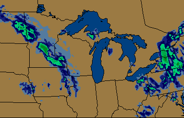
6. Maps. There is probably no better-known or more widely used
example of a two-dimensional figure being used to represent complex, multi-dimensional
data than an ordinary map. (Though to anyone schooled in information design,
no map can seem ordinary at all. Instead, the discerning information designer
will recognize every successful map as a powerful, imaginative, and often
ingenious solution to a difficult communication problem. Maps of course
come in a number of shapes and styles and serve a multitude of purposes.
Topographical
maps, for example, aim at the accurate and detailed representation
of the surface features of a region; weather maps consist of overlays
of meteorological data (usually gathered by radar or satellite photography)
spread over depictions of geographic areas.