ISP 120 - Quantitative
Reasoning
Group Activity 1: Poverty in the
(OpenOffice Version)
All group activities must include a signed statement from each group member that they participated fully in the assignment.
Please do the following at the beginning of every computer activity.
a. Open a new OpenOffice Writer (Text) document.
b. Click on the "File" on the top menu bar, then go to "Save As". Give your document a somewhat descriptive name (e.g. "Group Activity 1"). Also save the document to the desktop by setting the "Save in" textbox to "Desktop". (Saving to the desktop makes it easy to retrieve your work when you are finished.)
Activity
In this activity we will examine some data related to poverty in the
a. Assuming that a family of four living at the above poverty level includes only one adult who is working full time (40 hours a week, 50 weeks a year), how much is that person making per hour? Show your calculations.
b. Before proceeding to look at the data, briefly discuss among your group your speculations regarding: 1) approximately what percentage of the population as a whole is below the poverty line and 2) which states have the highest percentage of persons below the poverty level and which states have the least. In your Word document, write a paragraph responding to these two questions along with a brief explanation of your reasoning. We will be answering these two questions with official Census Bureau data later in this activity.
c. Open the file StatePoverty.xls, which contains
Census Bureau estimates for the number of persons below the poverty
level in 2003. (You may first need to
install OpenOffice on your computer if you have not
already done so, from http://www.openoffice.org The OpenOffice
spreadsheet application is called “Calc”; it is very similar to MS
Excel). Sort the data to determine which states have the most people
below the poverty line. There are two ways to sort. The easiest
way, which only works correctly if your data is contiguous, that is, not
separated by blank columns or rows, is as follows: First click in the top cell
of the column you want to sort by. Then click either ![]() or
or ![]() to sort
ascending or descending as the case may be
This will sort by the values in the left-most contiguous column (Column
A in this case) and will highlight all the cells that were sorted. If you want to sort by a different column
(column C in this case), you can then choose Data from the top menu, then Sort,
then select Column C in the "Sort by" box. Click "Descending" if you want to
sort from most to least, then click OK. A second
method of sorting that gives more fine-grained control over the process is as
follows: Select (highlight) all the data you would like to sort,
excepting header information. Typically this means selecting all the columns
you are working with. Then from the very top menu, choose Data and then
Sort. A window will then give you sort options.
to sort
ascending or descending as the case may be
This will sort by the values in the left-most contiguous column (Column
A in this case) and will highlight all the cells that were sorted. If you want to sort by a different column
(column C in this case), you can then choose Data from the top menu, then Sort,
then select Column C in the "Sort by" box. Click "Descending" if you want to
sort from most to least, then click OK. A second
method of sorting that gives more fine-grained control over the process is as
follows: Select (highlight) all the data you would like to sort,
excepting header information. Typically this means selecting all the columns
you are working with. Then from the very top menu, choose Data and then
Sort. A window will then give you sort options.
In your OpenOffice Writer document (Writer is the word processor in OpenOffice; it is similar to MS Word), list the two states with the most people below the poverty line and in a sentence explain why we can't necessarily conclude that these two states are the poorest.
d. Fill column D with the percentage of the population that is below the
poverty level. (In D6 and D7 type a label "Percentage Below Poverty Level". Then in cell D10, type
=C10/B10. Then fill the rest of the column. To fill, you can double click
on the small box in the bottom right hand corner of cell D10; alternately, you
can left click on this small box, then holding the mouse button down, move the
mouse down to the end of the column. To express your values in percent
click on the percentage button ![]() in the toolbars near the top of screen. You may express more
decimals in your values by clicking a number of times on the "Increase
Decimal" button
in the toolbars near the top of screen. You may express more
decimals in your values by clicking a number of times on the "Increase
Decimal" button ![]() ; to express fewer decimals click on the "Decrease
Decimal" button
; to express fewer decimals click on the "Decrease
Decimal" button ![]() .)
.)
e. Using Calc’s column sorting tools, determine the three states that had the highest percentage of persons below the poverty level and which three states had the lowest percentage. In your Writer (or Word) document, write a short paragraph listing the names and percent below the poverty line for these states.
f. Calculate the percentage of all persons in the 50 states who are below
the poverty level and paste the result in your Writer document. (You will
need to add all the data in columns B and C to
do this. There are many ways to sum a column in Calc. One way is
to click in the cell immediately below the data you would like to sum and then
click the sum button on the toolbar: ![]() )
)
g. Comparing the results of the questions in d and e to your group's speculations, how well did your group do? Were you surprised at all? Write a short response to this question in your Writer document.
h. We will now make a shaded map of the poverty data. The first time you do this, you will need to follow these instructions carefully. Open the link http://qrc.depaul.edu/maptool. Select with the mouse the data in column A and paste it into the Geographic Data column. Similarly, paste the data in column D into the other data column. This data is numerical and 4 classes is a fine level of shading for this map. Give the map a title, something like "Poverty Rates by State, 2003'" Make your map and then paste your map into your Word document. The easiest way to copy and paste your map into your Word document is to right-click on it and choose the "Copy". Then go back to your Word document and paste as usual.
i. In a short well-written paragraph, describe the
geographic patterns of poverty in the
j. Another map one could make of the data is below, which is a map of the data in columns A and C.
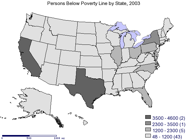
In a short well-written paragraph, explain why this map is not nearly as revealing as the map you made and why, for most analysis purposes, this map is not particularly useful.