Design Checklist
The following is a list of issues you should pay attention to when designing a web page or web site. If you follow these guides you
will most likely create a professional looking and enjoyable web site. Note I will be adding to this list throughout the quarter.
Communicating the Site's Purpose
- Show the company name and logo on each web page of your site.
- Have a summary what the site or company provides.
- Emphasize what your site does that is valuable to the user and different from others.
- Clearly designate one page per site as the homepage.
Text
- Text should not crowd along the left, use CSS margins
- Text should not stretch all the way across the page
- Text should be large enough to read. but not too large
- Use italics sparingly
- Background does not interrupt the text.
- Underlined text that is not a link
- Text that is too small to read
Navigation
- Don't use generic instructions (like "Click Here")
- Allow link colors to show visited and unvisited sites.
- The primary navigation links should be easily found. Usually placed along the top and or left side.
- Navigation buttons and bars are easy to understand and use. See Project Template.
- A large site has an index or site map.
- The navigation bar or buttons give the visitor a clue as to where they are, what page of the site they are currently on.
- Include a link from every non-homepage page to the homepage.
- Okay to remove the underline from main navigation links.
Links
- Link colors coordinate with page colors.
- Links are underlined so they are instantly clear to the visitor.
Graphics
- Buttons are not too big
- Every img tag has an alt attribute.
- Images files should be a reasonable size, no more than 70kb
- Always use the width and height attributes.
- Thumbnail images that are nearly as large as the full-sizes images they link to
Popup Windows and Animations
- Avoid splash screens.
- Avoid popup windows.
- Avoid blinking text.
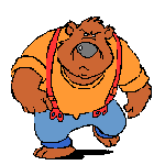
- Use animated gif's sparingly:
- Something like this is okay:

- Avoid something like this:
General Design
- Pages download quickly.
- Every web page in the site looks like it belongs to the same site.
- Avoid using frames for layout.
Junk
- Counters on pages
- Junky advertising
- Having to scroll sideways
- Too many little pictures on the first page of awards that don't mean anything
- Underconstruction signs
Alway Design With CRAP in Mind
- Contrast
- Repetition
- Alignment
- Proximity