ISP 120 Homework 3
1. Read the article "Chicago falls out of 1st in murders" by David Heinzman from the Chicago Tribune, Jan. 1, 2003. Then answer the following questions in your Word document (or Writer document if you are using OpenOffice).
a. Does the headline "Chicago falls our of 1st in murders" refer to an absolute quantity or a relative quantity? In other words, did Chicago fall out of first in absolute terms or in relative terms? Briefly explain.
b. In the second paragraph, the author states that "Chicago was way ahead of the pack in the murder rate..." According to the article, what is the "pack" that Chicago is ahead of?
c. Let us look more carefully at the complete 2001 data. (This is the data for the year before the article) Open the file HomicidesForCities2001.xls. Sort the data by the absolute number of murders. Which three cities had the highest number of murders in 2001?
d. In Column D, calculate the homicide rate (homicides per person). Paste into your Word/Writer document the top five rows of the resulting table.
e. Now sort the data by column D. Which three cities had the highest murder rates in 2001?
f. How many times greater was the murder rate for the Fairfield, Alabama than the rate for Chicago?
g. There were exactly four cities with population greater than 500,000 with a rate higher than Chicago's. Which were they?
h. Now sort by column B (population) in descending order to look at the largest cities in the US. Copy the top 10 rows of the table and paste them into a different part of your Excel (or Calc) spreadsheet. You should now have the just the cities with population greater than 1 million. Sort this table by rate and paste the resulting table into your Word/Writer document. Who is "ahead of the pack" here when we consider cities of population 1 million or greater?
i. What was the overall impression of the article and the accompanying graph? Given the additional data in the Excel file, do you think the article is misleading in certain ways? If so, how? Critique the use of quantitative information in the New Year's Day article.
2. Women in the United States continue to be paid less than men overall. Nationally, in 2003, the median weekly earnings of female full-time wage and salary workers totaled $552, while it was $695 for males. (Data is from the Bureau of Labor Statistics report http://www.bls.gov/cps/cpswom2003.pdf )
a. Fill in the blank using the data: In 2003, male full-time wage and salary workers earned _________ % more than female full-time wage and salary workers.
b. What percent of male full-time wage and salary worker median weekly earnings does the female median weekly earnings represent? (This percentage is often called the women-to-men's earning ratio.)
c. Using the data above ($552 for females and $695 for males), make a bar chart that purposely exaggerates the difference between men and women. Paste it into your Word/Writer document.
d. Using the data above ($552 for females and $695 for males), make a bar chart that purposely makes the difference between men and women seem small. Paste it into your Word document.
e. In the spirit of the story of Goldilocks, make a graph of the data that you feel gives the most accurate, non-biased view of the difference between male an female wages.
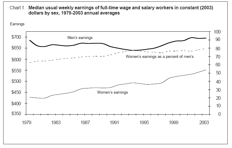
f. In the Bureau of Labor Standard's report
http://www.bls.gov/cps/cpswom2003.pdf, the authors include the following
complex chart.
In a well written paragraph, describe what this graph tells you about men's earnings over time, women's earnings over time, women's earnings as a percent of men's over time, and the relationship between men and women's earnings over time.
g. In the graph above, the line depicting women's earnings as a percent of men's intersects the men's earning line around 1994. Briefly explain what this occurrence on this graph tells you about women's and men's earnings around 1994.
h. Another graph found in the report is shown below:
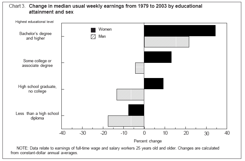
What type of graph is this graph?
i. True or False: The graph shows that women with bachelor's degree or higher earn more than men with bachelor's degrees or higher.
j. In a paragraph, carefully describe what this graph tells about changes in women's and men's earnings from 1979 to 2003. Describe changes across the categories as well as within the categories.
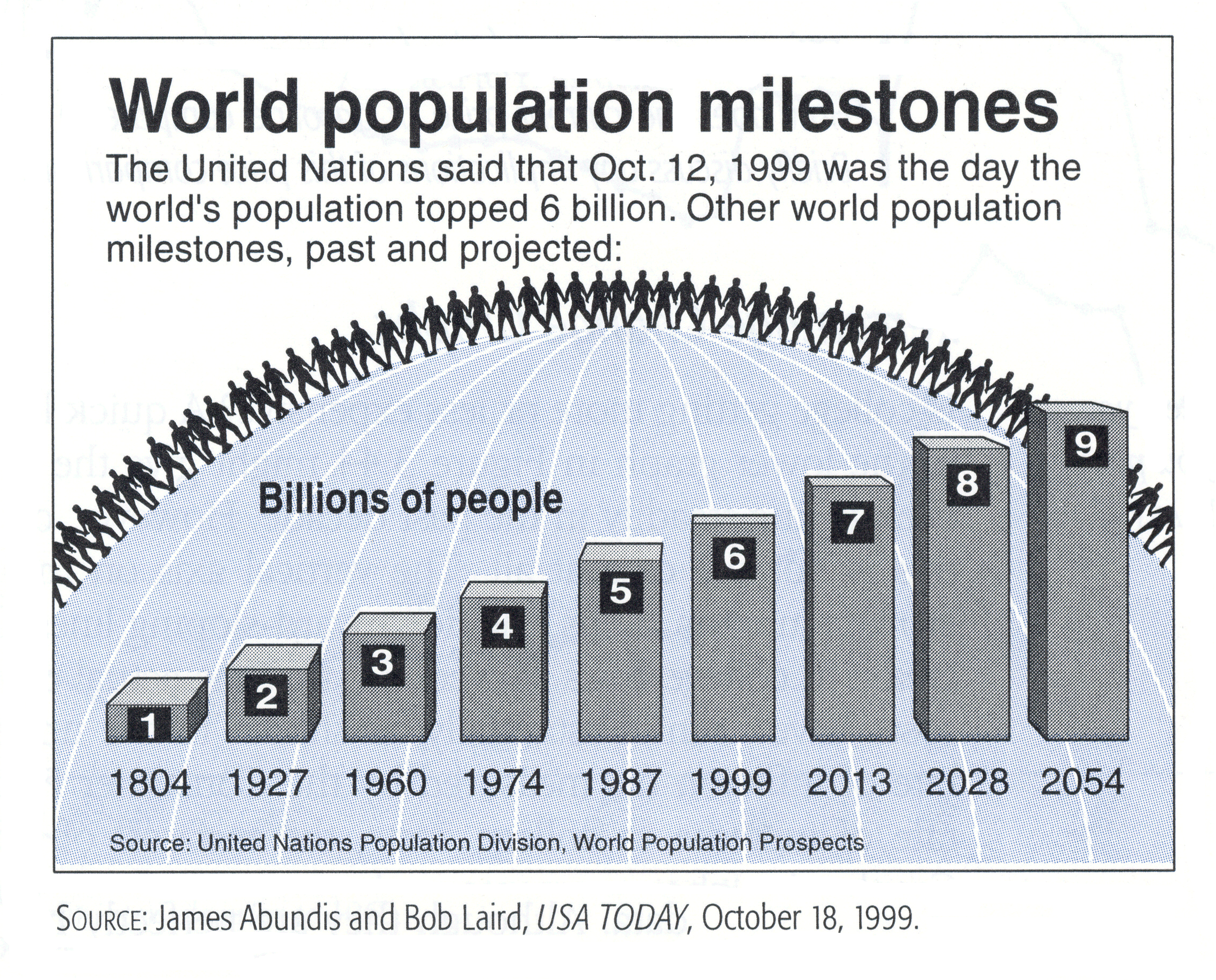
3. Critique the following graph: